
This topic describes the user interface for creating a conversational flow between a user and a Bot in a dialog task using the Dialog Builder tool in Kore.ai Bot Builder.
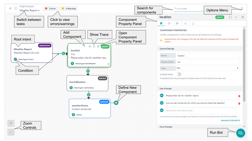 In the Search field, you can search component titles for any letters or words using find-as-you-type. Search matches are highlighted in the component titles.
Adding Dialog Task Components
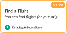
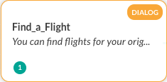
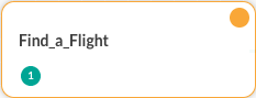
When you create a dialog task, by default the first component created and displayed is the user intent node or user intent component of the dialog task. The user intent is how the dialog task is identified by the end-user, for example, Search for a Flight, or Create a Ticket.
Additional components in the dialog task need to be added to perform the intent requested by the end-user. For example, for the Search for a Flight dialog, you should add additional components to query the user for the departure airport, arrival airport, and date.
To add a component, click either of the Add Component  icons as shown in the following illustration:
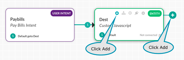
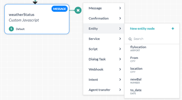
From the list displayed, select one of the component types, and then either select an existing component or create a new component as shown in the following example of creating a new entity node.
When create new is selected, the component is added to the dialog task with default properties that can be modified from the Properties Panel.
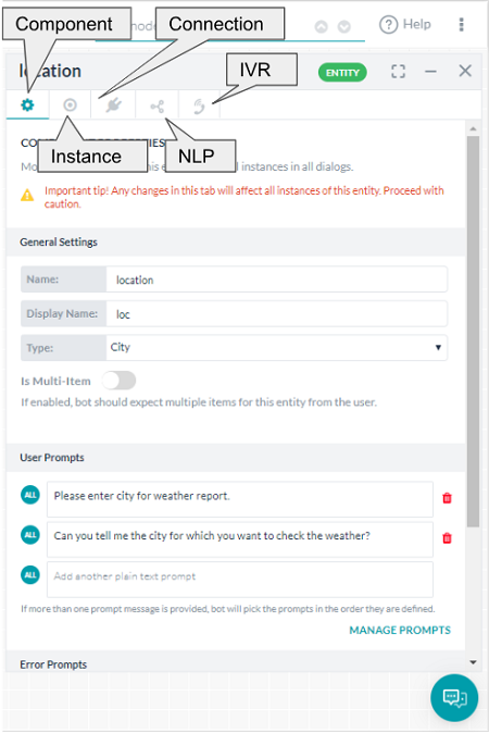
From the Properties Panel you can set:
- Component Properties like name, type and component specific properties;
- Instance Properties can be customized for the selected node for the current dialog;
- Connection Properties can be used for setting the transition conditions;
- NLP Properties for intent and entity recognition;
- IVR Properties for IVR channels (available for certain nodes only after IVR integration).
Depending on the type of component added, you will need to define various settings in the Properties panel. For more information, see the corresponding component types of documentation.
About the Options Menu
The Options menu is your access to Dialog Builder tool settings and commands such as view settings, dialog task settings, and dialog import and export. To access the commands on the Options menu, click the Ellipses  icon located on the upper rightmost side of Dialog Builder as shown in the following illustration.

Using Display Options
You can use Display Options to reduce unnecessary node information and better utilize screen real estate.
You can show or hide some or all of node type, node details, or connection details displayed in the Dialog Builder. For example, all details are shown in the following illustration for Show All.
Click Hide Node Type to removed the node name.
Click Hide Node Details to remove node descriptions.
Click Hide Connection Details to remove conditional transition details.
Click Hide All to show only basic node information with color coding.
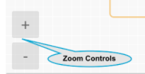
Using Zoom Controls
Zoom Options can be used to:
- Fit to page – Resizes Dialog Builder components and connections to fit within the display screen resolution for a single, non-scrolling page.
- Reset Zoom – Resets zoom settings to actual size.
Additional Zoom Option controls are available in the lower leftmost side of the Dialog Task builder shown in the following illustration.
Dialog Settings
The Dialog Task Settings dialog allows you to modify the dialog task basic settings, and if desired, set the visibility of a dialog to create a hidden dialog task that is available for use, but not shown as a bot task.

Add or modify the following settings for each dialog:
- Name – The Name of your dialog task, usually the main user intent, for example, Pay Bills.
- Description – An optional description of your dialog task displayed in Bot Builder.
- Options – Specify the behavior of this dialog task to the end-user:
- Sub intent only dialog – Task can be invoked only as a sub-task when another task is in progress. The task will not be presented as a bot task when the user requests for help.
- Hide from help – Task will not be presented as a bot task when the user requests for help. Users can invoke this task anytime while talking to the bot. Note this option will be selected automatically when the previous option is selected.
- Follow-up Task – Follow-up task array will contain all the intents detected from user utterances from this dialog. You can either:
- handle the follow-up tasks as part of node connections (default setting), or
- let the user select the follow-up task.
- Task Execution Failure – Define bot behavior when there is any error in task execution. It can be set as either:
- same as the Bot Level behavior
- specific to this task – initiate a task, run script or show a message
Exporting a Dialog
The Export command creates a .json file that is downloaded to the default download directory for your web browser.
The following JSON example is an exported file for a Dialog task with a single node.
{
   "_id":"dg-a2592e58-560a-5af5-81f6-3723f457c749",
   "name":"MyNewDialogTaskTest",
   "shortDesc":"Optional description here.",
   "visibility":{
      "namespaceIds":[
         "u-3bccf6c4-90e1-5471-94f6-259a4839abd9"
      ],
      "namespace":"private"
   },
   "nodes":[
      {
         "nodeId":"intent0",
         "type":"intent",
         "transitions":[
            {
               "metadata":{
                  "connId":"dummy0",
                  "color":"#299d8e"
               },
               "default":""
            }
         ],
         "metadata":{
            "top":170,
            "left":30
         },
         "nodeOptions":{
            "transitionType":"auto"
         },
         "componentIndex":0
      }
   ],
   "components":[
      {
         "desc":"Optional description here.",
         "type":"intent",
         "intent":"MyNewDialogTaskTest",
         "name":"MyNewDialogTaskTest",
         "dialogId":"dg-a2592e58-560a-5af5-81f6-3723f457c749"
      }
   ]
}
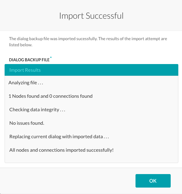
Importing a Dialog
After you have exported a dialog, you can Import the dialog to the same, or another instance of the Dialog Builder tool. When a file is imported, the data is validated to ensure the intent of the dialog is the same as the import file. Any new nodes or modified settings in the imported dialog are propagated to all other dialog components of the task.
To import a dialog
- On the Options menu, click the Ellipses icon to display the Import command.
- Click Import, and then in the Import a Dialog dialog, click Choose File.
- Navigate to your previously exported dialog, and then click Import.
The Import Successful dialog and the results of the import are displayed as shown in the following illustration.
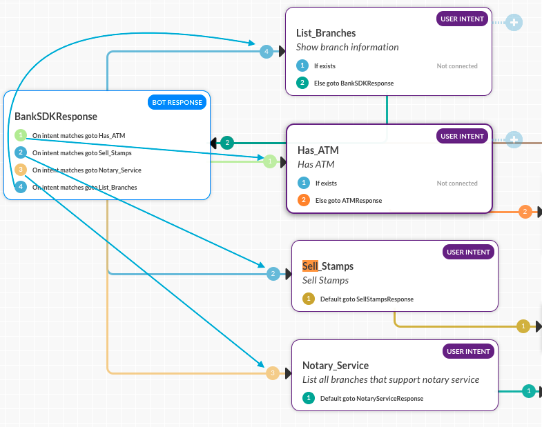
Color-Coded Connections
The conditions or transitions from one component to another are labeled by a colored arrow showing the path to the next node based on the connection condition defined. In the following color chart, the order of connection color assignment is shown.
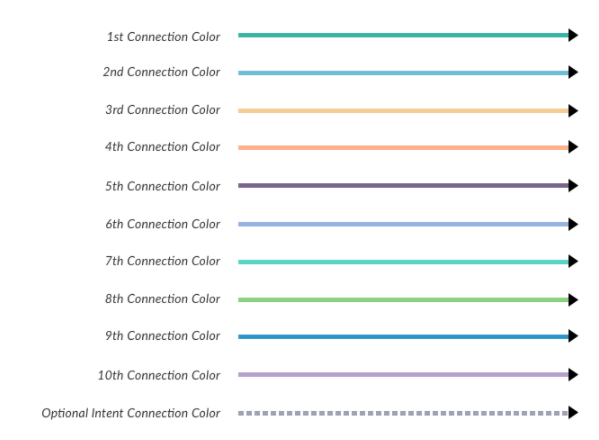
When multiple conditions are defined with multiple connection options to other components, the colored arrows help you visualize the flow as shown in the following illustration.
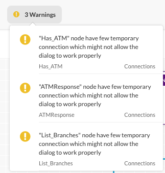
Troubleshooting Your Dialog Task
A real-time set of errors and warnings is available as you define your dialog task located in the upper rightmost corner of Dialog Builder. Click the information icon to display any errors or warnings as shown in the following illustration.
In addition, you can view the flow of your dialog task from the start of the root intent to a selected component by using the Show Trace  icon as shown in the following illustration.
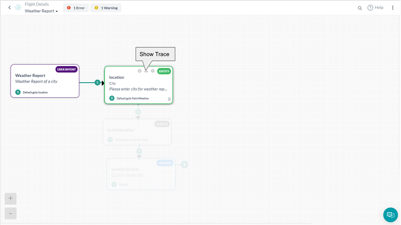
In the previous illustration, any components of the dialog task that are not directly in the dialog flow for the selected component are grayed out. Using the trace feature you can look for a broken flow or conditional transition issues. Click ShowTrace again to remove the trace.