This feature was released in v7.3 of the platform and is in the ![]() (beta) state.
(beta) state.
Virtual Agents engage end-users primarily using a conversational interface that typically includes an exchange of a series of messages. But oftentimes, there is a need to gather information from the end-user to proceed further. Examples include providing delivery address while interacting with an eCommerce agent, details of an issue while reporting to ITSM agent, opportunity details while creating a CRM opportunity, capturing customer details to create a bank account, etc.
In a standard Dialog Task, this scenario is designed by placing a series of Entity Nodes connected back-to-back and the user is asked for values for each of these entities sequentially, which is quite tedious and frustrating. Instead, an interactive User Interface for easy and efficient capture of all the information from the user will be ideal.
Kore.ai’s Digital Form caters to such requirements by providing a range of input fields required for capturing the required details from end-users. After the users complete the form, the input is submitted to the virtual agent to proceed with the task at hand.
In this document, we discuss the features and implementation of Digital Forms in the Kore.ai Bots platform. To jump to a use case example for a step-by-step implementation of a Digital Form click here.
Highlights
- Improved user experience with a single interface for input collection.
- Easy form creation using simple drag and drop actions.
- Vast component library to cater to all your form requirements.
- Provision to define rules for input validations and visibility suiting your use case.
- Automatic dialog task generation from the Form enabling switching between Form or Conversation experience based on the channel of interaction.
Setup
You can access Digital Forms from under the Bot Tasks menu.
Following are the steps to configuring Digital Forms:
- Form Creation: Define a Digital Form by adding components and configuring their properties.
- Form Invocation: Forms are invoked from inside a task or process:
- A form is included as a component in the task to define the task definition. The dialog task offers Form Experience and Conversation Experience based on the channel of interaction.
- A Digital Form is added to a Digital View with a dialog task triggered when a form is submitted from there.
- Form Submission: On submit from the user, the component values are validated and any errors are highlighted. Based on the mode of invocation, post successful validation:
- The bot execution proceeds as per dialog flow in case of dialog task invocation.
- The selected task is triggered from the pane.
Form Creation
A Digital Form includes a definition and various components to capture user input.
To create forms, follow the below steps:
- On the left pane, click Bot Tasks.
- On the Bot Tasks page, click Digital Forms > Create New.
- On the New Form page, enter
- Name of the Form
- Display Name for the Form
- Description of the Form
- Click Save & Proceed.
Components Addition
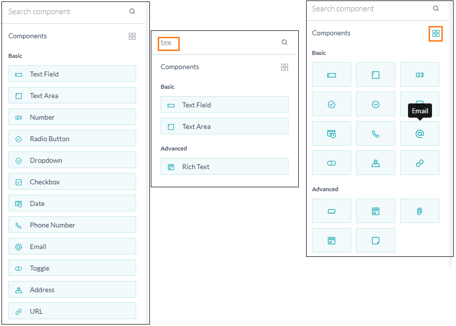
- You can drag and drop the components available on the left pane to the canvas and configure their properties to build the form. For details of the components & their properties, see below.
- You can search for a given component, scroll through the list.
- View in a grid format.
Form Actions
From the Forms Listing page, you can:

- Create New Form, as seen above.
- Edit Form, see below.
- Use the Branding option to customize the form, see here.
- Test the form, see here.
- Delete the form.
Edit
You can use the Edit option from the form listing to edit the form. Following actions are performed on the Form in edit mode: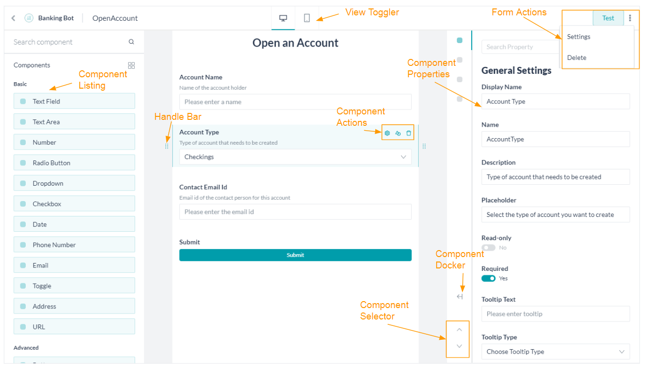
- Component Listing is used to selecting and adding components to the Form by simple drag and drop action.
- Use View Toggler to switch between Desktop View and Mobile View.
- Use the Handle Bar against each of the components to change its location by a simple drag and drop action;
- Use Form Actions to:
- Test the form to see the preview of the Digital Form in the Bot Builder.
- Delete the Form.
- Change the Form Settings like name, display name, and description.
- Use the Component Actions to access the Settings, Duplicate, and Delete the component.
- You can change the components’ properties from the Component Settings popup:
- Use the Component Docker to dock/undock the settings pane to the screen.
- Use the Component Selector to navigate through the components on the Form.
Branding
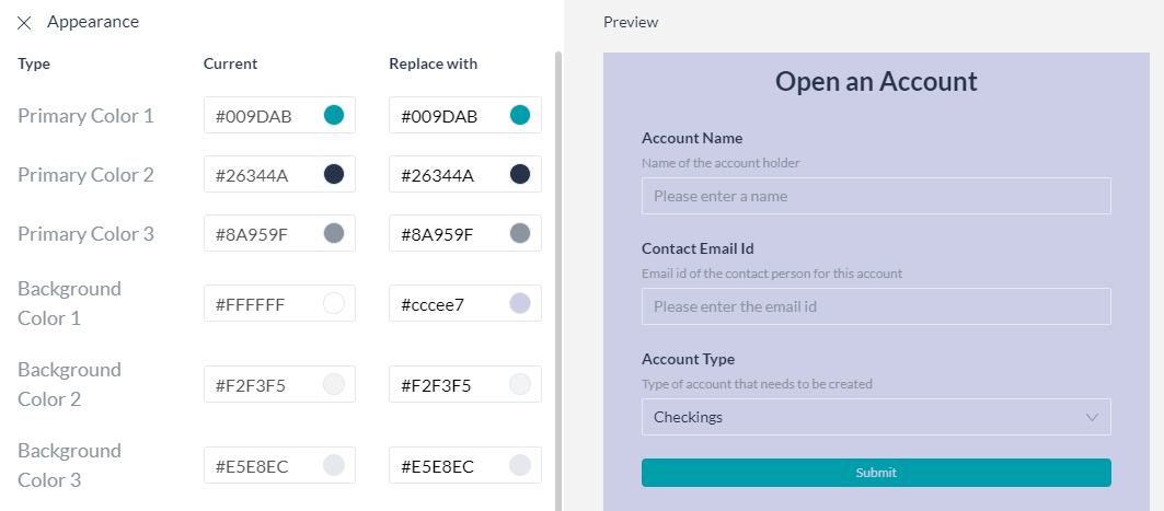
Use the Branding option to change the look and feel of the form to reflect your organization’s standards. An instant preview gives you an idea of how the form would look with the new colors and you have the option to Save or Restore Default scheme.
Test
Form Invocation
Following are the ways a Digital form can be invoked:
- From a Task: You may include a form as a component in a dialog task for defining the task. The dialog task offers Form Experience and the usual Conversation Experience for filling the form data. You can choose the preference based on the channel of interaction or any other criteria based on your requirements.
- From a UI flow: You can add a Digital Form to a pane and choose a dialog task to trigger when the form is submitted from the pane.
In the following sections, we discuss each of the above invocation processes.
From Tasks
Digital Forms are used inside Dialog Tasks for capturing user inputs through a Form Node.
To invoke form from a dialog task, follow the below steps:
- Create/open the dialog from where you want to invoke the Digital Form.
- Click the + icon next to the node where you want to add the Form.
- Select the Form option and then the form from the list. You can choose to add a Digital Form directly or use an existing Form Node.

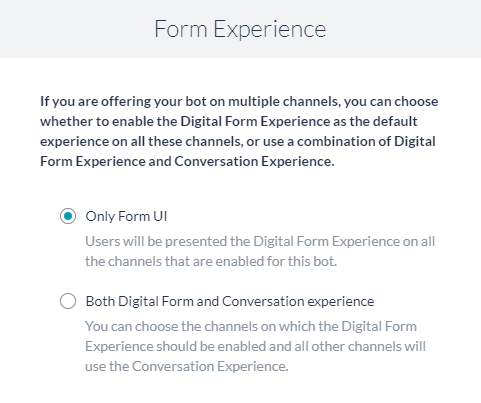
- You are prompted to select the Form Experience, it can be:
-
- Only Form UI – This creates a Form Node and associates it with the Digital Form selected. This is the default option.

- Both Form UI and Conversation Experience – This further prompts you to choose a channel. When a user is using one of the selected channels they are presented with a Form UI, the rest of the channel users get a conversation experience.
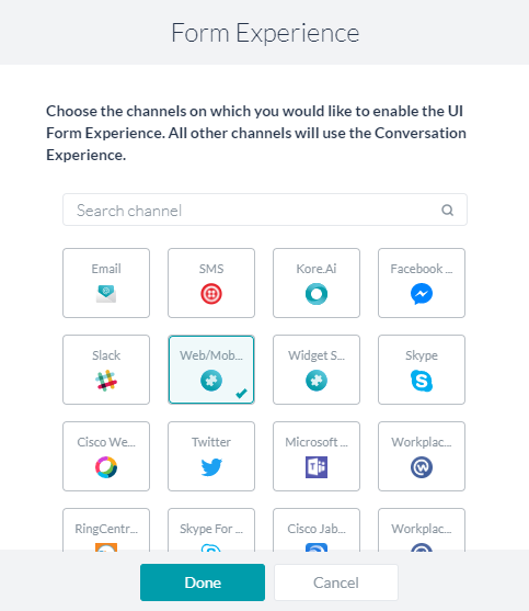
This option creates:- A Group encompassing the following nodes (see here for details). This grouping can be renamed and/or deleted.
- A Logic Node to determine the transitions to the Form Node and the Sub-dialog Node based on the channels selected.
- A Form Node for the Digital Form, same as was generated for the Only Form UI above.
- A Sub-dialog Node to capture the required entities (as defined in the Digital Form using components) for the conversational experience. See below for the mapping.
- A Group encompassing the following nodes (see here for details). This grouping can be renamed and/or deleted.
- Only Form UI – This creates a Form Node and associates it with the Digital Form selected. This is the default option.
-
- You can set the Properties for each of the nodes added.
- The Form Node (see here for details).
Of special interest are the following Component Properties:- Submit Message – Message displayed to the end-user on successful submission of the form
- Web/Mobile SDK Form Behavior – Using this option you can either have the form displayed inline the chat window or open on a full page.
- Logic Node, in case of the conversation experience flow, can also be configured (see here for details)
Of special interest are the following:- Manage Context Variables is used to create and set values for the context variables. Remember to use the full path of the variable in the key field ie. context.BotUserSession.<variable_name>
- We strongly urge you not to make changes to the connection settings as this affects the bot performance.
- Sub-dialog Node is configured as normal (see here for details)
Of special interest are the following:- Use the Entity Post-assignment to capture the user input.
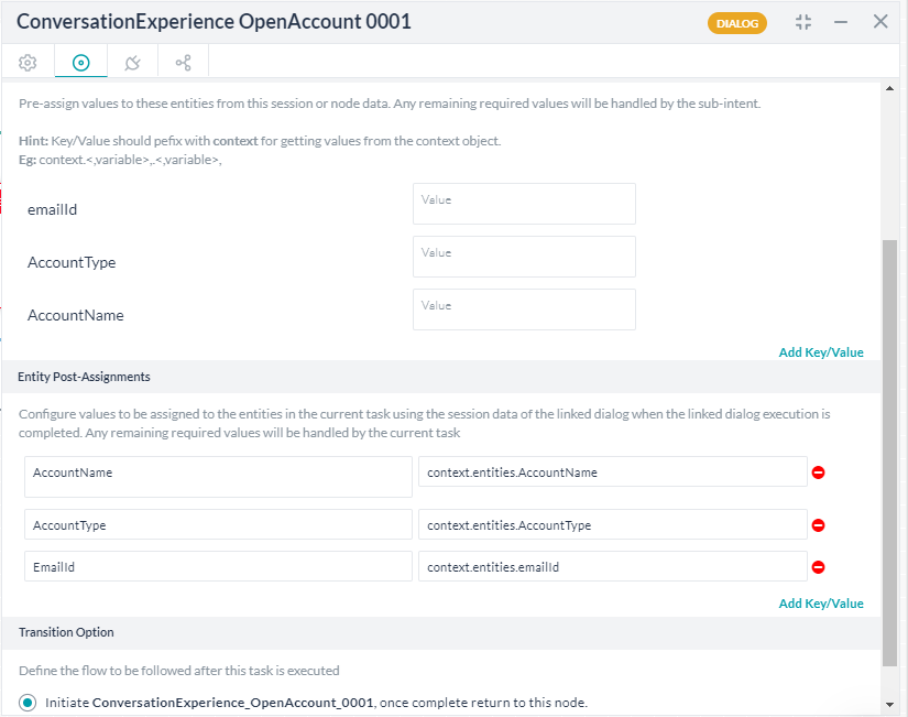
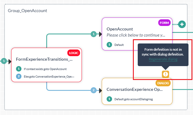
- In case you modify the sub-dialog or the source form, you are presented with an option to Regenerate Dialog. This ensures that the changes are reflected in the task without having to rebuild the entire task. Be aware that the changes are reflected in all places this sub-dialog is used.
- Use the Entity Post-assignment to capture the user input.
- The Form Node (see here for details).
- The user input can be accessed as follows:
- Form component values are accessed (see here for details) using
{{context.forms.<form_name>.<component_name>}} - In the case of the sub-dialog, the variables used in the post-assignment settings as
{{context.<variable_name>}}
- Form component values are accessed (see here for details) using
- You can continue with the Dialog Task as per your business needs. For example, you can use the Form Component values as input to a Service Node to update the data or use the Script Node to process it further. If you are using the conversation experience too, remember to connect the auto-generated sub-dialog to the process flow.
From Panels
Digital Forms are rendered in Digital Views by configuring Widgets & Panels, see here for more on Digital Views.
To invoke form using Widgets and Panels, follow the below steps:
- Create a widget to invoke the Digital Form.
- Enter the name.
- Select Digital Forms as Source.
- Add Form by selecting from the drop-down list.
- Select the Dialog to Invoke on Submit from the drop-down list.
Note that while a Digital Form is used to define multiple Widgets and also add to multiple panes, it will be associated with the single Dialog Task across all Widgets and Panels. - Save the widget.

- Add Widget to an existing pane or create a new pane.
You can add a form directly to a pane, it creates a widget by default.
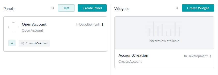
- You can Test the pane.
- Follow the steps given here to publish and host the panes.
Process Flow
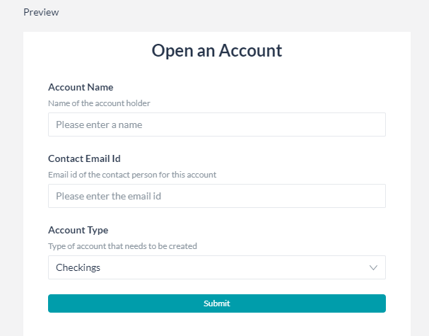
When the end-user initiates the dialog and reaches the node connecting to the Form node, the following events take place. Depending upon the experience selected at design time and the channel of invocation, the following is the flow:
- Form experience:
- A link to the form is presented to the user
Note that for synchronous WebHook channel, instead of a link the complete form definition is sent click here for more details.
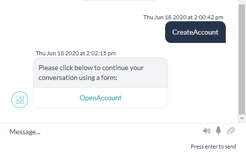
- Clicking the link opens the form in either full-screen or inline mode, based on the selection. Special notes about the link:
- The link is active only for a certain duration of time, it becomes inactive after that.
- Even within the active period, it can be used only a limited number of times.
- End-user can fill in the values for the components/fields.
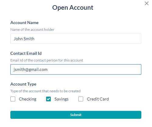
- Every form comes with a default Submit button. This validates the form entries, prompts for any missing values.

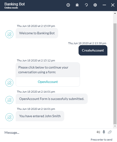
- Once the form is validated and submitted, the values are available in the context variable and accessed using the following code:
context.forms.<form_name>.<component_name>
Here we are capturing the user entry and displaying it using a message node.
- A link to the form is presented to the user
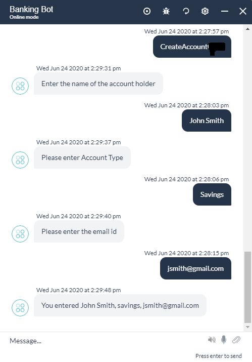
- Conversation Experience:
Exceptions
When exceptions are encountered during the dialog execution with a Form Node, they are handled as follows:
| Exception | Exception Behavior |
|---|---|
| The user tries to continue the conversation without opening the form link | The Manage Interruption Settings are honored and when the user is returning to the form, then a new form link will be displayed |
| User tries to continue the conversation (in the chat window) without submitting the form responses | The Manage Interruption Settings are honored and when the user is returning to the form, then a new form link will be displayed |
| User closes the form or browser without submitting responses | The form displays a warning message that the task will be canceled If the user accepts, the form will be closed and a message is displayed saying that the previous task is canceled |
| The user tries to relaunch the form while the form is already open | The form link will not open the form and a message will be displayed saying that the form link is no longer valid. |
| The user tries to relaunch the form after moving ahead in the conversation | The form link will not open the form and a message will be displayed saying that the form link is no longer valid. |
Panel Flow
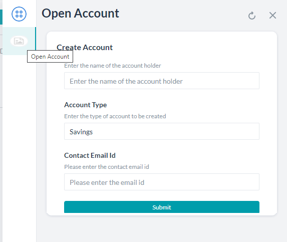
Users can access the form using Panels & Widgets. The experience is the same as for the Process Flow with Form experience.
Once the form is validated and submitted, the values are available in the context variable and accessed using the following code: context.forms.<form_name>.<component_name>
The following is the experience:
Bot Management
Publish
The publishing flow for a bot with Digital Forms has the following special cases:
- As with any bot, the Digital Forms exist in the following states:
- In-development when a form is created.
- Awaiting approval when a form is submitted to Publish and the request is waiting for the admin to take action.
- Rejected when the Publish request is rejected by the admin.
- Published when the Publish request is approved by the admin.
- Suspended when a published form is suspended by the admin.
- The following validations are performed before a Publish request is processed:
- A Dialog Task that contains a Digital Form can be published only if:
- The corresponding Digital Form is already published, or
- The corresponding Digital Form is also selected for publishing.
- A Digital Form that is configured to trigger a Dialog Task is published only if:
- The corresponding Dialog Task is already published, or
- The corresponding Dialog Task is selected for publishing.
- While the dependencies are published together, chances are that all the dependencies might not be available at run-time, in such cases:
- If the Dialog Task is in a published state, but the Digital Form is not in a published state this triggers:
- The Task Failure Event and the corresponding behavior is invoked or
- A relevant Standard Response is displayed and
- Logged as Failed Task in Analytics.
- Digital Form is in a published state, but the Dialog Task is not available then on Form submission, the end-user is presented with the Form’s Error Message.
- If the Dialog Task is in a published state, but the Digital Form is not in a published state this triggers:
- A Dialog Task that contains a Digital Form can be published only if:
Import/Export
Bot Export
- Option to export Digital Forms in In-development and Published copies are available.
- Digital Forms can be selected/deselected from the Bot Export page under the Bot Tasks category.
- Choose the option to Include dependent dialogs to export Dialog Tasks that are integrated with the selected Digital Forms to define widgets. Note that this does not include the Sub-dialog Tasks generated using Digital Forms.
- Complete information of each of the selected forms are available in the export file and this includes:
- Fields
- Field properties
- Form integrations
Bot Import
- Digital Forms are included in the full and incremental import of the bot.
- For Full Import:
- As with all other bot components, the full import replaces the entire Digital Forms and form details in the bot.
- For Incremental Import:
- You can choose to include/exclude the Digital Forms in the import.
- This import fully replaces the Digital Forms that are common to the import file and the bot.
- Additional forms in the file are imported into the bot.
- Additional forms in the bot are retained.
- Post import, any invalid Digital Form integration details are disassociated with the corresponding forms.
Component Details
Components List
Following is a list of available components. For details on the properties of each component, see below
Component Properties
The following are the properties that can be set for each of the components.
Note: Not all the properties are valid for all the components, refer to the property matrix for the mapping:
| Property | Description |
|---|---|
| Display Name | This is the text which appears against the component for the end-users. |
| Name | This is the reference name that can be used for referencing the component in the other components of the form and form level operations |
| Description | Help information about a field to be displayed to the end-user. |
| Placeholder Text | A prompt message for the end-user |
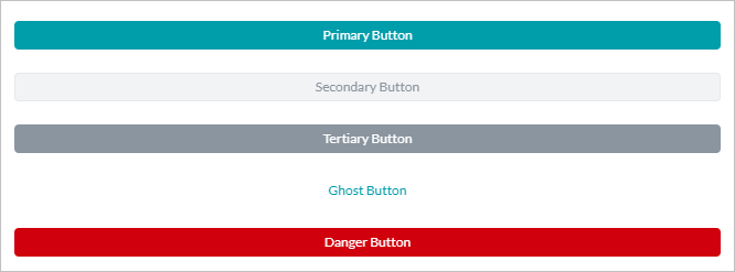
| Button Style | For button component, can be:
|
| Button Action | For button component, can be:
|
| Read Only | To mark the component value is not changeable |
| Required | To define whether input for this field is necessary or optional for the end-user entry. |
| Tool-tip | Additional information about a field to be shown on demand to the end-user. Has three entries:
|
| Time | To enable the end-user to enter Time along with Date |
| Time Format Used in conjunction with the above Time property |
Time format to be presented to the end-user can be 12 hrs or 24 hrs |
| Data Settings | |
| Default Value | In case the component needs to be pre-populated with a default value |
| Values | For Radio Button, Dropdown and Checkbox, add values to be given for selection by the end-user. You can mark one value as a default value |
| Multi-Select | For Dropdown, if the user can select multiple values. |
| Validation Settings | |
| Default Error Message | To be displayed in case user entry fails validation |
| Validate | To define when the validations defined for a field are to be checked. Options are:
|
| Validation Rule | Rules in the following format can be added
Multiple rules added to an existing rule would be taken as an AND condition, whereas a new rule would be an OR condition. You can add multiple Simple rules or a single Advanced rule by toggling between Simple and Advanced Modes |
| Custom Error Message | This would be displayed when a particular validation fails |
| Visibility Settings | |
| Is Visible | Whether the given component is visible to the end-user or not |
| Visibility Rules | You can define conditions when a particular component would be visible or hidden
Multiple rules added to an existing rule would be taken as an AND condition, whereas a new rule would be an OR condition. You can add multiple Simple rules or a single Advanced rule by toggling between Simple and Advanced Modes |
| Auto Populate | |
| Auto Population | Whether the given component should be auto-populated or not |
| Auto population rules |
|
Component Mappings
Properties
Basic
| Property | Text Field | Text Area | Number | Radio Button | Check box |
Drop down |
Date | Phone Number | Address | URL | Toggle | Range Slider | |
|---|---|---|---|---|---|---|---|---|---|---|---|---|---|
| General Settings | |||||||||||||
| Display Name | Yes | Yes | Yes | Yes | Yes | Yes | Yes | Yes | Yes | Yes | Yes | Yes | Yes |
| Name | Yes | Yes | Yes | Yes | Yes | Yes | Yes | Yes | Yes | Yes | Yes | Yes | Yes |
| Description | Yes | Yes | Yes | Yes | Yes | Yes | Yes | Yes | Yes | Yes | Yes | Yes | Yes |
| Placeholder Text | Yes | Yes | Yes | No | No | Yes | Yes | Yes | Yes | Yes | Yes | No | Yes |
| Read Only | Yes | Yes | Yes | Yes | Yes | Yes | Yes | Yes | Yes | Yes | Yes | Yes | Yes |
| Required | Yes | Yes | Yes | Yes | Yes | Yes | Yes | Yes | Yes | Yes | Yes | Yes | Yes |
| Tool-tip | |||||||||||||
| Tip Text | Yes | Yes | Yes | Yes | Yes | Yes | Yes | Yes | Yes | Yes | Yes | Yes | Yes |
| Tool-tip Type | Yes | Yes | Yes | Yes | Yes | Yes | Yes | Yes | Yes | Yes | Yes | Yes | Yes |
| Tool-tip Position | Yes | Yes | Yes | Yes | Yes | Yes | Yes | Yes | Yes | Yes | Yes | Yes | Yes |
| Time & Time Format |
No | No | No | No | No | No | Yes | No | No | No | No | No | No |
| Data Settings | |||||||||||||
| Data Source | No | No | No | Yes | Yes | Yes | No | No | No | No | No | No | No |
| Default Value | Yes | Yes | Yes | Yes | Yes | Yes | Yes | Yes | Yes | Yes | Yes | Yes | Yes |
| Multiselect | No | No | No | No | No | Yes | No | No | No | No | No | No | No |
| Auto Fill | |||||||||||||
| Auto Populate | Yes | Yes | Yes | Yes | Yes | Yes | Yes | Yes | Yes | Yes | Yes | Yes | Yes |
| Auto Populate Settings | Yes | Yes | Yes | Yes | Yes | Yes | Yes | Yes | Yes | Yes | Yes | Yes | Yes |
| Visibility Settings | |||||||||||||
| Is Visible | Yes | Yes | Yes | Yes | Yes | Yes | Yes | Yes | Yes | Yes | Yes | Yes | Yes |
| Visibility Settings | Yes | Yes | Yes | Yes | Yes | Yes | Yes | Yes | Yes | Yes | Yes | Yes | Yes |
| Validations | |||||||||||||
| Default Error Message | Yes | Yes | Yes | Yes | Yes | Yes | Yes | Yes | Yes | Yes | Yes | Yes | Yes |
| Validate | Yes | Yes | Yes | Yes | Yes | Yes | Yes | Yes | Yes | Yes | Yes | Yes | Yes |
| Equals To | Yes | Yes | Yes | Yes | Yes | Yes | Yes | Yes | Yes | TBD | Yes | Yes | Yes |
| Not equal to | Yes | Yes | Yes | Yes | Yes | Yes | Yes | Yes | Yes | Yes | Yes | Yes | |
| Contains | Yes | Yes | No | No | No | No | No | No | No | No | No | No | No |
| Does not contain | Yes | Yes | No | No | No | No | No | No | No | No | No | No | |
| Regex | Yes | No | No | No | No | No | No | No | No | No | No | No | |
| Max Length | Yes | Yes | No | No | No | No | No | Yes | Yes | Yes | No | No | |
| Min Length | Yes | Yes | No | No | No | No | No | Yes | Yes | Yes | No | No | |
| Part of | Yes | No | No | No | No | No | No | No | No | No | No | No | |
| Not part of | Yes | No | No | No | No | No | No | No | No | No | No | No | |
| Greater than | No | No | Yes | No | No | No | Yes | No | No | No | No | Yes | |
| Less than | No | No | Yes | No | No | No | Yes | No | No | No | No | Yes | |
| Greater than or equal to | No | No | Yes | No | No | No | Yes | No | No | No | No | Yes | |
| Less than or equal to | No | No | Yes | No | No | No | Yes | No | No | No | No | Yes | |
Advanced
| Property | Button | RichText | Pro-tip | ||||
|---|---|---|---|---|---|---|---|
| General Settings | |||||||
| Display Name | Yes | Yes | Yes | ||||
| Name | Yes | Yes | Yes | ||||
| Description | Yes | No | Yes | ||||
| Placeholder Text | No | No | No | ||||
| Tool-tip | Yes | Yes | No | ||||
| Error Message | Yes | No | No | ||||
| Required | No | No | No | ||||
| Validate | Yes | No | No | ||||
| Read Only | Yes | No | No | ||||
| Action Type (Submit, Reset, Clear) | Yes | No | No | ||||
| Data Settings | |||||||
| Data Source | No | No | No | ||||
| Default Value | No | No | No | ||||
| Auto Fill | |||||||
| Auto-Populate | No | No | No | ||||
| Auto-Populate Settings | No | No | No | ||||
| Visibility Settings | |||||||
| Is Visible | Yes | Yes | Yes | ||||
| Visibility Settings | Yes | Yes | Yes | ||||
Dialog Node
The following mapping gives the type of entities included in the sub-dialog when it is auto-generated from a Digital Form.
| Form Component Property | Dialog Task Node Property |
|---|---|
| Name | Name |
| Display Name | Display Name |
| Placeholder Text | Entity Prompt |
| Error Message | Error Prompt |
| Digital Form Component Type | Dialog Task Node Type |
|---|---|
| Text Field | String |
| Text Area | Description |
| Number | Number |
| Radio Button | LoI (Enum) with each of the options in the radio button group copied as list items |
| Dropdown | LoI (Enum) with each of the values in the dropdown list copied as list items. Multi-select would be enabled based on the ‘is multi-select’ option of the Form Component |
| Checkbox | LoI (Enum) with each of the options in the checkbox group copied as list items Multi-select is enabled by default |
| Date | Date |
| Phone Number | Phone Number |
| Address | Address |
| URL | URL |
| Toggle | LoI (Enum) with each of the options in the toggle copied as list items |
| Range Slider | |
| Advanced | |
| Button | Not Applicable |
| Label | Not Applicable |
| Protip | Not Applicable |
| Note | Not Applicable |
Context Object
The following mapping gives the context object to capture the component value along with a sample context object.
| Component Type | Context Object |
|---|---|
| Text Field | context.forms.<form_name>.<component_name> |
| Text Area | context.forms.<form_name>.<component_name> |
| Number | context.forms.<form_name>.<component_name> |
| Radio Button | context.forms.<form_name>.<component_name> |
| Dropdown | context.forms.<form_name>.<component_name>[<index>] |
| Checkbox | context.forms.<form_name>.<component_name>[<index>] |
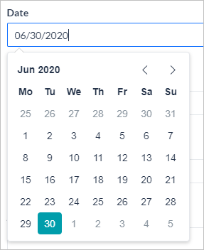
| Date | context.forms.<form_name>.<component_name>In mm/dd/yyyy format |
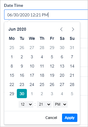
| Date & Time | context.forms.<form_name>.<component_name>In mm/dd/yyyy hh:mm AM/PM format |
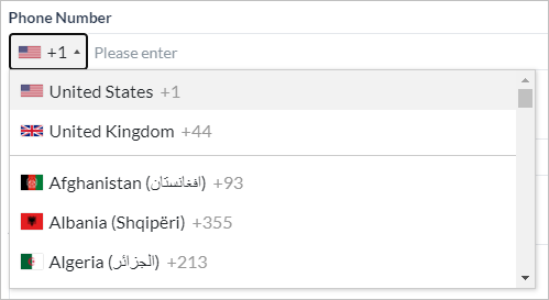
| Phone Number | context.forms.<form_name>.<component_name>prefixed with the area code of the country selected by the user |
context.forms.<form_name>.<component_name> |
|
| Address | context.forms.<form_name>.<component_name> |
| URL | context.forms.<form_name>.<component_name> |
| Toggle | context.forms.<form_name>.<component_name>Yes/No values |
| Range Slider | context.forms.<form_name>.<component_name> |
| Sample Context Object |
|---|
"forms": {
    "basicpropertieslist": {
      "TextField": "text",
      "Textarea": "text area",
      "Number": 123,
      "Radio": "Male",
      "Dropbox": [
        "UnderGrad",
        "Other"
      ],
      "Checkbox": [
        "Education",
        "Technology"
      ],
      "Date": "07/08/2020",
      "Date&Time": "07/08/2020 19:00 PM",
      "PhoneNumber": "+919999999999",
      "Email": "test@gmail.com",
      "toggle": "Yes",
      "Adress": "Address",
      "Url": "test.com",
      "rangeSlider": 26.1
    }
  }
| Sample Context Object for form pre-filling data |
|---|
Pre-filled form data from channels like WebHook can be accessed using the following context object
context.prefillForms.<form_name>.fields
Limitations
- Digital Forms will not work as expected on the following channels:
- Amazon Alexa
- Cisco Jabber
- Google Assistant
- IVR Voice
- Twilio Voice
You are advised to choose the Conversation Experience for these channels.
- Digital Forms created in the parent bot are not inherited into Smart Bots.
- The Digital Forms functionality is not applicable for Universal Bots.


